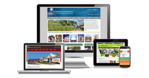
A responsive website, also referred to as mobile friendly when properly designed it will adjust to the device it is being viewed from. Whether it is a desktop, laptop, tablet or smart phone, a responsive website should automatically adjust text, images and videos from any device, with a specific navigation that is easy to use.
 The importance of having a Responsive Website
Today, it is not only a must that a website responds to the size of the screen, but the search engines require it to otherwise your site will lose page ranking when people do a search for your products and/or services.
When a responsive website design is done correctly by a website developer, it will be tested to make sure that its functionality and layout are working properly on all screen sizes, even when the user is doing online shopping. This is especially important since people are expecting your website to be easy to navigate no matter what device they are using to find you.
Mobile websites can also be optimized for the search engines to help drive traffic to your website. That is why having a smart, eye appealing easy to navigate responsive (mobile) website is key to the success of your online business.

What Needs to be done to make a Responsive Website
To simplify the process, it is a combination of using a WordPress theme that is designed to be responsive. Utilize either code or a page builder like Elementor that is easy to use and has the ability to test on all view types (desktop, tablet & mobile).
The header and any banners should be checked in mobile mode to make sure that they look as good as they do in desktop mode. If they are not, your web developer should make the necessary adjustments so that it does. Same applies to the footer, it too should be tested and adjusted where it is needed.
Checking page text, images, and videos to make sure that they too are flowing well on the page no matter what device they are using. Images should be able to scale properly, and text should remain at a readable size and flow down the page when your website is in mobile mode.
Mobile Device Usage is on the Rise
It has been found that 97% of the people search the internet to find the products and services they want, and over 70% do it from their mobile devices. People are comfortable now buying online on their different devices, so it is important that your website gives your potential customers what they want otherwise you can lose out to your competitors.
If you would like us to check your website to make sure it is responsive, or are considering a new website or redesign, then please call us at (303) 335-7955 or Email Us Here.
Victor Torres, Website Developer
Simple Website Services